

“Exponential growth models of physical phenomena only apply within limited regions, as unbounded growth is not physically realistic. Although growth may initially be exponential, the modelled phenomena will eventually enter a region in which previously ignored negative feedback factors become significant (leading to a logistic growth model) or other underlying assumptions of the exponential growth model, such as continuity or instantaneous feedback, break down.” Wikipedia
INTRODUCTION
Much ado about something, recently, with an article in the Times of Israel. The article describes the work of Professor Isaac Ben-Israel, set forth informally on his Facebook page. The mathematical model, a simple polynomial regression (as nearly as I can make out), was applied to worldwide cases and several countries: Israel, Taiwan, Singapore, Italy, Sweden. Prof. Ben-Israel says the data show that the number of new cases peaks in about 40 days and goes to almost zero in 70, irrespective of mitigation efforts.
His work has been hotly disputed by epidemiologists and doctors, who say there’s no science there, just number crunching. I strongly disagree with that argument, and I’ll explain why below.
MY BIAS
Let me give a disclaimer: I don’t have much respect for the analytical insight of doctors. Why? Long ago and far away, in my persona as a physical chemist I taught physical chemistry and biophysical chemistry to undergraduates, including a large proportion of premeds. The premeds were very bright, but they wanted formulas to memorize and standard problems to which the equations could be applied. I gave modified open book exams (two pages of handwritten notes allowed) and when questions such as “how far can a duck fly, 20% grade” were posed, there were shouts of protest, as there were with questions asking “derive ΔA = maximum work from the 1st and 2nd Laws, stating conditions.” In other words, they were not desert island scientists, drawing equations in the sand. They were good at organic chemistry and I was awful.
Now as with any generalization, one realizes there are outliers who aren’t described by a characterization of the average. Not all Democrats are pro-abortion. Not all MD’s are formula soldiers. Nevertheless, I see a tendency in the presentations of the MD’s speaking about covid-19 to rely on previously set …how shall I put it… established models rather than looking at the data directly. Those MD’s who claim regression analysis is just number crunching are mistaken.
A SHORT HISTORY OF REGRESSION ANALYSIS AND WHY IT WORKS
Francis Galton (1822-1911) was the first to fit statistical data to an equation. In relating the heights of sons (dependent variable, y) to the heights of fathers (independent variable, x) by a linear equation, y = a + bx, he found that taller fathers tended to have shorter sons, whereas shorter father tended to have taller sons, whence “regression to the mean height,” or “regression analysis. Now at that time there was no explanation from genetics or biology as to why this regression should occur; it was just an empirical fact that illuminated a mass of data.
Since that time regression analysis, in more complicated and varied ways, has been an essential tool in statistical analysis. And again, it is not always the case that there is a scientific model underlying the analysis. It is just a way to derive factual information from a mass of data (with appropriate precautions: for example, don’t predict beyond the given data range)
WHAT PROFESSOR BEN-ISRAEL’S ANALYSIS IS TELLING US.
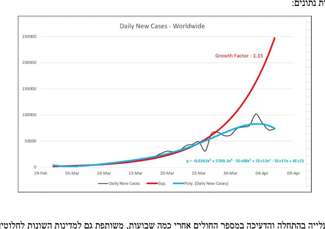
In order to show what Prof. Ben-Israel has proposed, I’m going to insert some of the graphs from his informal web publication (see the link above).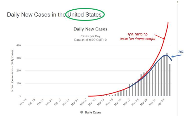
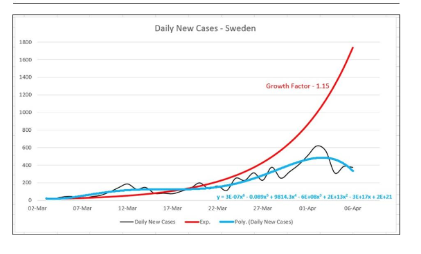
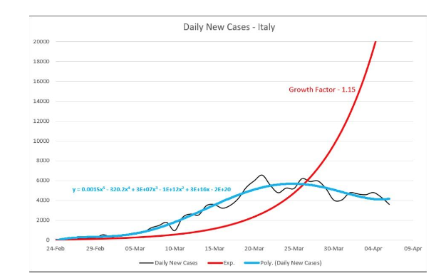
The red line in each graph shows exponential growth, e.g. doubling in n days (about 0.6). The black wavy line is the observed daily number of new cases. The blue line is the observed cases fit to a polynomial regression (a+ bx + cx²+…). Notice that most of the curves begin as exponential growth, then reach a maximum and then decrease. The conclusion from analyses carried out for a number of countries: the maximum is reached in 40 days, and a decrease to very little in 70 days.
One other point that seems evident from the graphs. The exponential fit parameter, 1.15, fits the US early data well, but not that for Sweden or Italy. For Sweden, the factor should be less to fit the early data and for Italy, larger. This presumably relates to different contagion rates in each country.
That there is no scientific model to explain the 40 day max and 70 day diminishment times is, I believe, irrelevant. What’s important is that even though the conclusions are drawn from a number of different countries with different mitigation policies, there is a common conclusion.
Questions?
NOTE
One difference I’ve noted between the data from European and American countries compared to Asian and African countries: there is cyclic behavior (about a week for the period of the cycle) for the European and American data that is absent from the Asian and African. Weekend holiday for the Wuhan soldiers in unfamiliar territory?


South Dakota’s new case numbers for this week:
4/12 +104 (first day of triple digit increases; also a doubling of the number of cases since the previous double on 4/7)
4/13 + 130
4/14 + 120
4/15 +180 (increase in order of magnitude [1000+ cases] since last order of magnitude increase on 3/30)
4/16 + 143 (number of cases doubled again)
4/17 +100
Tomorrow will be the 40th day since the initial 5 confirmed cases back on March 10.
So I suppose if there’s any truth to this, I should see our numbers plateauing over the next couple of weeks.
Regarding the weekly cycle in the West: Don, in his daily death toll post, has pointed to spikes in the death count around Monday or Tuesday that seem to be related to fewer people working over the weekend.
We keep hearing how little we know about the virus. Given that, saying there’s no scientific basis for what the numbers show is a little silly. No, we don’t know what the negative feedback is, but data analysis can tell us where to look.
Regarding extrapolation, as an engineer with six kids, I like to point out that if you plot a child’s weight over the first 6 months, you can predict they’ll weigh 500 lbs by their 4th birthday. Data range matters.
I’ve been following the numbers for the Dakotas, Minnesota, Iowa and Nebraska since April 5th. In that time. every state except North Dakota has experienced an increase in order of magnitude (i.e. they all went from fewer than a thousand cases since to over a thousand): Minnesota and Iowa on 4/8, South Dakota on 4/15 and Nebraska today, 4/17) Every state except North Dakota has also experienced a doubling in the number of cases in since I started tracking back on 4/5, Minnesota on 4/16, Iowa on 4/14, South Dakota on 4/7, 4/12, and 4/16. North Dakota will double tomorrow.
His work has been hotly disputed by epidemiologists and doctors, who say there’s no science there, just number crunching.
At that point, I stop regarding them as experts speaking on their field and view them as just folks defending their ego.
Finding a pattern that even mostly fits when numbers are fed in is science.
You can check the numbers that are fed in, you can check the conclusions drawn from it, you can try to find situations that don’t match– basically, you try to break it, because that’s science.
Obvious place to go? Other outbreaks. Historical ones. See if he’s discovered a fancy way of predicting the peaks and valleys, and if that can be used to get the average incubation period, etc. See if when you apply it elsewhere, you find a flaw.
TEST IT!
You don’t cross your arms and say “that’s not science!”
/rant off
One thing I didn’t notice…the graphs show the same time for max and diminishment but different maxima. That must be the case since clearly different exponential rate constants apply to different countries. And those different rate constants imply different contagion factors.
One thing I didn’t notice…the graphs show the same time for max and diminishment but different maxima. That must be the case since clearly different exponential rate constants apply to different countries. And those different rate constants imply different contagion factors.
That’s kind of important. Japan has a three-digit death toll and we have a five-digit death toll and a deeply troubled economy to boot. I’m hoping at this point we can have a moratorium on gatherings (especially those which involve song), working six-feet apart, and ubiquitous personal protective gear. With that, we can allow those under 50 to return to everyday life and those under 60 w/o excess body mass to do so as well. (I’d like some data on estimates of where these ‘new cases’ are coming from: nursing homes, hospitals, homes, or some other loci).
The total numbers — maximum, area under the curve, etc. — logically have to be influenced not only by what’s actually going on but by measurement and classification practices (sample selection, diagnosis criteria), which complicates comparisons further but influences the overall pattern only if policy changes partway through.
The pattern seems logical enough. At any given level of interaction and thus potential transmission, it increases for a while and then starts running out of new people. This does imply that changes in behavior (e.g., loosening or disobeying restrictions, the phased reopening plan) without eradication will almost inevitably result in additional successive peaks; it also makes it likely that in the US (for example), different areas should show separate cycles. Currently analysis of the country as a whole is probably heavily dominated by the NYC area and should perhaps be broken down further.
This is not an argument that we shouldn’t reopen. The restrictions introduced are not sustainable — economically, psychologically, medically. Putting off elective and preventive medical procedures indefinitely kills people too. The UN of all entities is issuing warnings about death tolls in the millions from economic downturns. The deaths in nursing homes are terrible; the idea of telling everybody with a high probability of dying within the next year or two that hey, they can never see their families again, is deeply disturbing. In combination these make getting the curve over with as fast as we can handle the severe cases look significantly more appealing.
But we do need to anticipate these effects and prepare for them, and judging from the memes about going to all the bars when things reopen, it seems like some people are really not clear on the idea of moderation, or on the difference between “mandatory” and “a good idea.” I’m not sure how to get that across to people who are currently going on about rich people trying to murder everybody’s grandparents to restore their stock portfolios, but would probably be horribly offended if I pointed out that if the whole country can do this for weeks (or the months or years they want), then obviously people with STDs can easily handle the much less drastic practice of abstinence.
Maxima means the high point on that arch, right?
Where it caps out before heading back down?
Isn’t the theory that it’s at about 40 days, not how big it is– and the graph of identified cases show that reported cases are, ah, not paying much attention to the 1.15.
So how high it gets isn’t involved– only that it goes up, and when it will go down?
Foxfier, the max is important for practical reasons. I intuit that this is dependent on the rate constant k, i.e. on initial contagion factors.
The number under the curve (area) will be directly related to the maximum value if the curves have a similar form. So what the theory has to show is why does the max occur at about 40 days? (By the way, when I showed this article to my wife, she remarked “40 days! how biblical!”
Yes. The maximum (sorry, I used the plural) is the high point on each curve, and his analysis basically seems to be that it happens at the same time (relative to… first report? that actually strikes me as a little strange given differences in monitoring and the suspicion of earlier spread, but I guess “bad enough we noticed and counted it as the start of an outbreak”?) regardless of how high it is.
Which… ah… seems to rather contradict the “flatten the curve” models where you can have a high peak fast or distance to achieve a low peak later with (I think) the same area under the curve. Although I’m not sure what the sum of multiple curves would look like….
I should say that his analysis does not necessarily imply my conclusion that we would have subsequent curves, and I should have been clearer about that. That is my personal interpretation on the grounds that even if the virus starts tailing off under specific conditions, it seems to me that if we increase interaction while there are still cases floating around, and it is subtle enough that we cannot plausibly quarantine everybody contagious, then we shouldn’t be surprised if some of the people who avoided it so far do get it.
…On reflection, I have no idea why I thought anybody was talking to me, but I should have been more specific in the first place anyway. I had also not previously thought about the apparent difference from the much-publicized flattening model, with its delayed peak, but maybe the assumptions behind that one would be a place to start looking, or maybe there’s something weird about defining the zero point, I don’t know.
There’s a serology(?) study out of Santa Clara county (my old stomping grounds) in which they found enough people with Wuhan Flu antibodies to suggest that the incidence of infection is underreported by a factor of 50 to 85 times. (Would that be by 500% to 850%, or 5000% and 8500%?) If this is true, then the Wuhan Flu is likely less lethal than seasonal flu.
I mention it because maybe that explains the 40 days to peak infection thing, at least somewhat. This thing incubates for so long before it becomes symptomatic, and most people experience such mild symptoms, that, by the time health officials become aware of the problem, it’s already too late to do much about it.
Report here.
Read about at Ace of Spades.
So what the theory has to show is why does the max occur at about 40 days?
That would be a different question, though– right now, it’s “does this hold true”, isn’t it?
My mind explodes.
Let the young / middle age get back to work.
Lesson learned: The Ivory Tower/ Never Land .experts know nothing. What have they and the elites gotten right in the past 20 years? Come on, tell us. I say, “Nothing.”: And, the answer always is “it could have been so much worse, and give them more discretion.”
What saved the World from the 1918/19 Flu pandemic? They didn’t lock down WWI or the economies. What I saw [on the net so it’s true – sarcasm] was it hit hard in Fall/Winter, lulled, and hit again the next Fall. Then, it went away.
Frederick (II) The Great said, “He who defends everywhere defends nowhere.”
Of course, wear bandanas/coffee filters//masks/paper towels, keep your filthy hands away from your ugly face, wash your hands, wash down/disinfect surfaces, stay home if sick, etc.
Protectively quarantine the aged, long term care facilities, health care workers, those with chronic illnesses, had-hit minorities, the obese, et al.
Going forward prepare infrastructure for an uptick. Hopefully but unlikely, they’re learning efficient ways to treat the China Murder Virus.
Economic suicide is not a solution.
Apparently this kind of pattern has been noticed before– it’s called Farr’s Law.
https://spinstrangenesscharm.wordpress.com/2020/04/19/covid19-update-april-19-2020-israel-reopens-nyc-vs-rest-of-usa-quick-takes/
Down at the bottom.
Seems like it’d be important enough to pay attention to, y’know?
/sigh
Thanks Foxfier for the link, I’ll look into it.
(later–edited). I’ve looked at the reference link in the linked article and I’m not sure it’s that useful. Farr’s Law (1840) posited a normal type curve for epidemiology. Such a distribution is symmetric in time, which is obviously violated by the observed patterns. Perhaps a superposition of an initial exponential plus a gaussian normal curve decay might work.
Another observation: if you look at the world map and the US daily cases it almost appears as if its the superposition of two curves. Is that because localities started to use the CDC guidelines (including non-Covid diagnoses) or ????
< a href=https://www.cebm.net/covid-19/covid-19-william-farrs-way-out-of-the-pandemic>William Farr’s way out
Ferry Interestink!
Bob-
Odd, the only thing I could find before my eyes glazed were that it was a pear shaped distribution.
The CDC guidelines were actually tighter than what some states and countries were doing– but I would suspect that tests is a big variable, too, plus whenever Medicare declared the rate they’d pay COVID-19 claims at.