Donald R. McClarey
Cradle Catholic. Active in the pro-life movement since 1973. Father of three, one in Heaven, and happily married for 43 years. Small town lawyer and amateur historian. Former president of the board of directors of the local crisis pregnancy center for a decade.
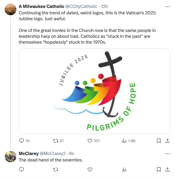


Looks to me like a convoluted rainbow flag attempt. No? How about Noah’s ark 2.0?
BTW, as an old navy man, and lifelong fisherman, I learned long ago that the best of anchors can’t stop an ark from sinking.
Is that a James Martin logo? Sure looks like one.
Father Z had a nice juxtaposition of this logo with, well, something either more horrifying or less horrifying than the logo, depending on one’s perspective. https://wdtprs.com/2022/06/you-have-seen-the-logo-for-the-2025-jubilee/
I work in graphic design and animation, and I cringe every time I see these things. Logos are not my specialty, but I’ve done enough to know that it takes a lot of time and effort and talent to be able to create something that is both simple enough to be a logo and communicates the brand or thing it represents and is actually usable for that purpose. Logos are emphatically NOT something that should be chosen as part of a contest, and this logo effectively serves as the QED.
As for the logo:
At first glance it looks like clip art that one would have added to a Word document back in 2005. The figures themselves don’t really communicate anything other than “generic clip art figure,” and the gradients are tacky and inconsistent. The use of primary colors is a classic rookie move and serves (beyond potential “rainbow reich” inferences) only to make it feel childish, which is accentuated by the uninspired composition and shapes. The figures are also arranged very haphazardly, and while I can see how there might might a rotational flaring towards the upper left (based on the rotation of the “point” on the ghost’s bodies), that rotation doesn’t have any relation to the curvature of the anchor/cross nor is it consistent, and thus doesn’t have any meaning or just isn’t cohesive within the overall work.
Of course, potentially most flagrant in terms of design is that the imagery doesn’t cohere with the message. I get that it’s trying to give the sense of a journey over the water for the “pilgrimage” part and that the cross is the source of “hope,” but the anchor negates this meaning since anchors serve to fix one in place, rather than being a symbol of a journey, except very obliquely in being a component of a ship. It’s this trying to force fit so many disparate images and meanings into the visual motif that is a sure sign of bad design and again is why logos (or any design for that matter) shouldn’t be done by means of contests.
Also, this logo is not terribly usable as a logo. It already looks terrible in color, but the use of primary colors (and gradients at that) means that it will look even more awful on anything other than white. It will lose its current visual separation if made greyscale, and will be unusable in one-color as it will cease to look like a ghost conga line (well, maybe that’s not a bad thing…)
As an aside, as I was looking into this logo, the AI summary of the Brave browser was incorrect about the designer and listed it as Copa Design. I clicked on their site and found that they apparently had also submitted a design for this contest. And while I think it has some small issues as a logo (I would have leaned more into the shell visually), it’s light-years better than whatever this is. You can tell that theirs is well-thought through and is actually usable as a logo as can be seen from the various iterations on the brand guide; it works in color, in black and white, one-color, inverted one-color, etc. You can check it out here:
https://www.copa.design/work/jubilee
They do have a line in their write-up at which I can only shudder (emphasis mine):
Ouch.
Pilgrims of hope? Let us hope and pray that the Jubilee year 2025 will result in significant conversions, especially for the members of the lavender Mafia and those who wish to promote homosexuality as an accepted lifestyle choice within our clergy. May those with same-sex attractions stay out of ministry for their own sakes and for the Holy Catholic Church who is striving for its members to become holy.
The logo?
At least it’s not Rupnik’s work.
I like the Copa design.
The world has traded transcendence for trans, and we are left with this.
Jason – yours is an interesting analysis from a design point of view. Totally agree that good logo designs are meant to be a representation of the organisations or movement for the purpose they have been created for. I fail to see how a rainbow congo line and a crucifix with an anchor tail is meant to evoke “hope”. The designer has not created a good logo. But that’s what you get when you have a mediocre executive team who can’t put a proper design brief together for a simple logo. ie. the current Vatican administration.
[…] Anniversary of Summorum Pontificum – A Catholic LifeFrom Felt Banners, Save Us O Lord – Donald R. McClarey, J.D., at The American […]
Reminds of Fischer Price like people on a float in a Gay Pride Parade. Pilgrims of Hope – hope for what? Acceptance by the Catholic Church of gay matrimony, openly gay clergy?
God will help us take back our church from the unbelievers! Its’ already in the works. Traditional habits for nuns. Gregorian chant and other arrows pointing the way to a rebirth of faith . Thanks be to God!
Didn’t they use that for something a few years ago?
I swear I’ve seen this logo before.
[…] Anniversary of Summorum Pontificum – A Catholic LifeFrom Felt Banners, Save Us O Lord – Donald R. McClarey, J.D., at The American […]